
Main Menu
Coursework
Graphing
OTHER SUBJECTS:
English
French
ICT
Maths
OTHER SECTIONS:
About Us
Bookshop
Coursework
Downloads
Links
Revision Tips
 Getting to Grips with Excel
There are many ways of producing a better scientific graph than in Excel. That said, most people have easy access to the program, so here we tell you how you should use it!
X-Y Scatter
In Physics, you will almost always want to plot an X-Y Scatter graph of two columns of data. In this case we have plotted the activity of a radioactive source against time:
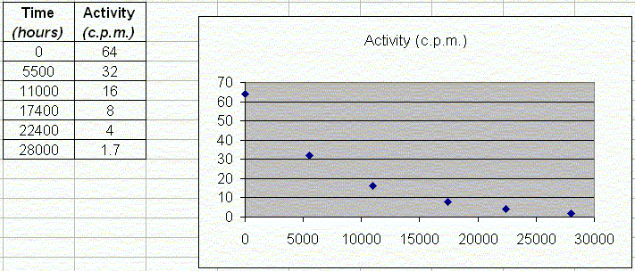
Fig. 1: Basic plot of raw data
If we had plotted this by hand, the last thing we would do is join up the points! What we would like Excel to do is join the points up with a smooth curve - so called a best line. To do this, right click a point and choose Add Trendline....
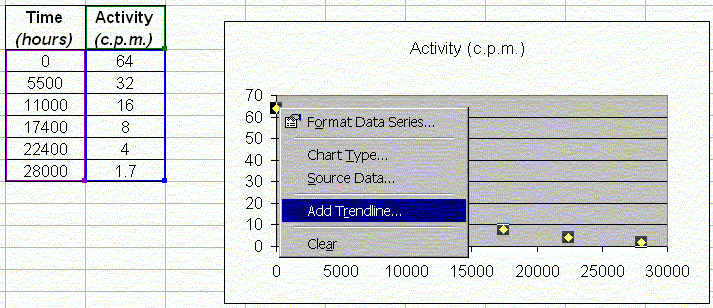
Fig. 2: Adding a trendline to Excel
Next Page: trendline types and more